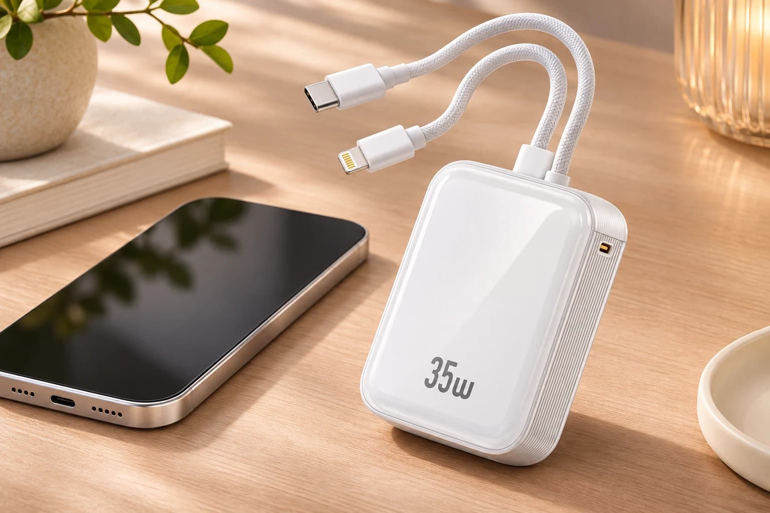
Quick answer
To prepare a logo for a custom power bank, send an editable vector master, a visual reference, the exact product and finish, a proposed logo size and position, and clear color requirements. Then approve a sample made on the actual surface using the proposed marking method. A good-looking digital mockup is useful for discussion, but it cannot establish print adhesion, material contrast or the appearance of the finished mark in normal lighting.
For most projects, the decisive step is not choosing the file extension. It is connecting the correct artwork revision to the correct model, surface, process and approval record. This guide explains that handover for brands, distributors and corporate gift buyers. Available processes, dimensions, order quantities and commercial terms must be confirmed for the selected ZONNGOO configuration rather than inferred from a concept image.
Introduction
A company logo may look simple, yet transferring it from a screen onto a small electronic product creates practical decisions. A fine line can disappear at the proposed size. A colored logo can lose contrast against a dark body. A design positioned attractively on a photograph can interfere with a display, a magnetic-contact area or required product information when placed on the actual unit.
The best brief resolves these questions before production artwork is released. Start with the product and intended use: everyday retail, a branded giveaway or a coordinated gift set. Decide what the customer needs to recognize, and which details must remain readable. Then ask the supplier to review the real surface and provide a specific sample plan instead of treating a generic rendering as an approved manufacturing instruction.
1. Identify the exact product and marking surface
State the complete model reference, battery series, body color and finish. Similar-looking products can use different face materials or coatings, so the same logo treatment may not produce the same appearance. A metal frame does not necessarily mean that the intended front marking area is metal. Identify the actual face on which the mark will sit and ask the supplier to confirm its material.
Use a product photograph or drawing to indicate that face, but keep the product reference in the written brief too. If a project includes multiple colors or battery-series variants, list them separately. Do not assume that approval on a white sample automatically covers a black version. Changes in surface finish may affect color, contrast and the process that is suitable for the job.
2. Supply a usable master and a viewing reference
An editable vector master is generally the most useful starting point for a geometric logo, because the artwork can be scaled and its shapes inspected without relying only on pixels. Common working formats include SVG, AI, EPS and vector PDF, subject to the supplier’s software workflow. A PDF can also contain a raster image, so its filename alone does not prove that the artwork is editable vector content.
Include a simple viewing file, such as a PNG preview, so the recipient can check that the master opens as intended. Keep both files on the same revision. If you only have a small image from a website, disclose that limitation and discuss artwork preparation before approving production. Enlarging a low-resolution logo does not restore missing edges or recover the original geometry.
3. Resolve fonts, linked objects and file versions
Ask the designer to check whether fonts or linked graphics are required to open the master correctly. For production exchange, an outlined text version can prevent font substitution, while an editable source should remain available in your own archive. Keep a reference preview of the correct letterforms so changes are easy to spot. Do not assume every recipient has the same font installed.
Give the artwork a unique revision and date, and state which file is the release candidate. Multiple attachments called “final” invite mistakes. If a color or letter changes after review, update the master and preview together. Record the change in the approval thread rather than relying on the supplier to infer which of several similar files should replace the previous version.
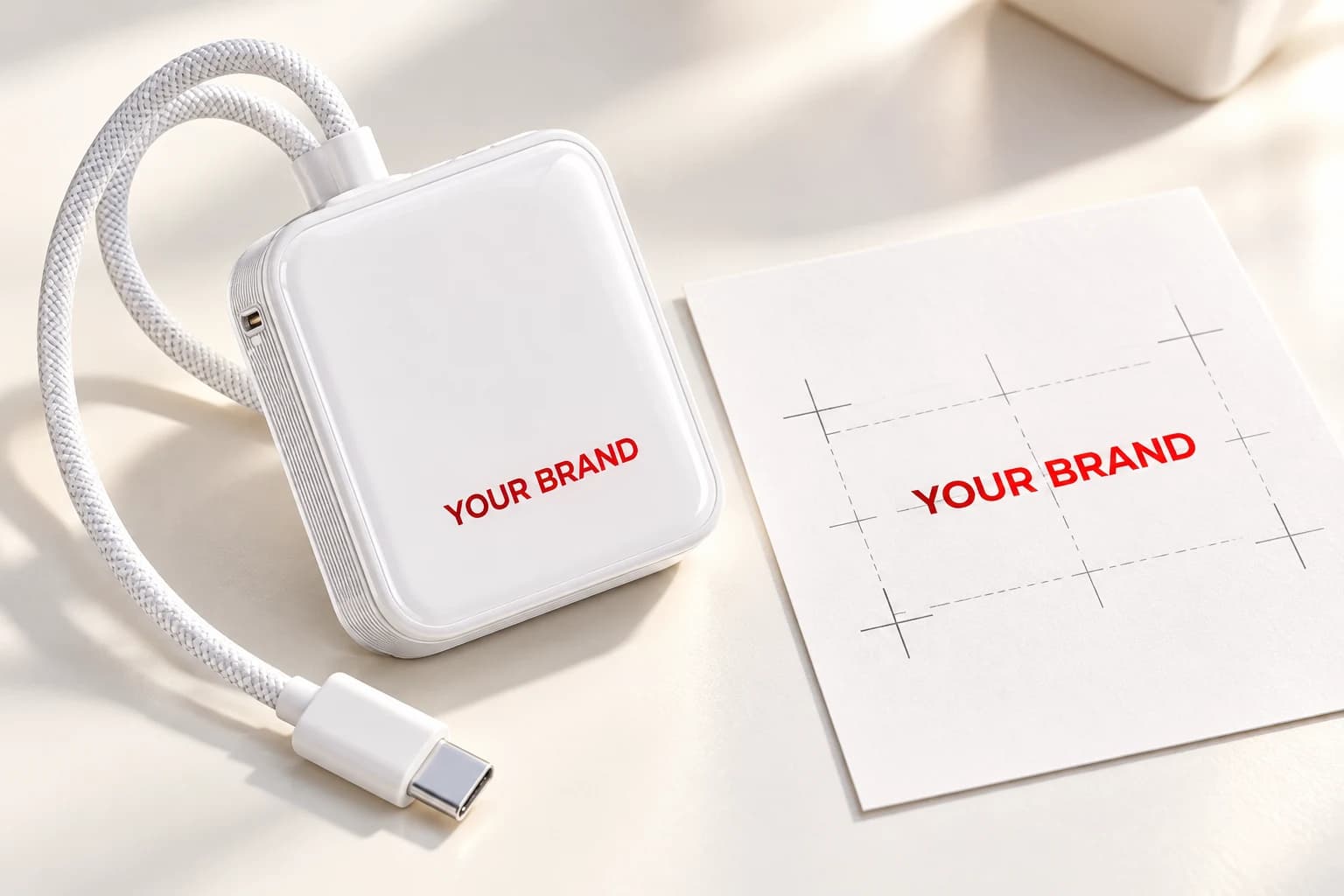
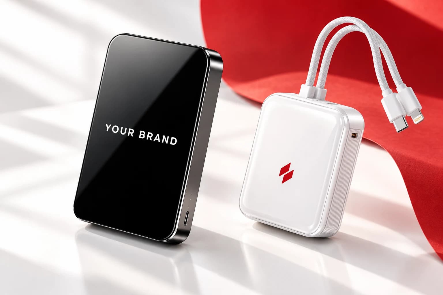
AI-generated artwork concept: use the actual product dimensions and an approved source file for production.
4. Specify real dimensions and a physical position
Provide the proposed width and height in millimeters, plus a clear location reference. “Centered” needs context: centered on the whole housing, on a flat panel or within a supplier-defined marking area may produce different positions. Ask for the available area and an agreed placement tolerance. Do not invent a universal minimum line width or edge clearance; these depend on the process and selected surface.
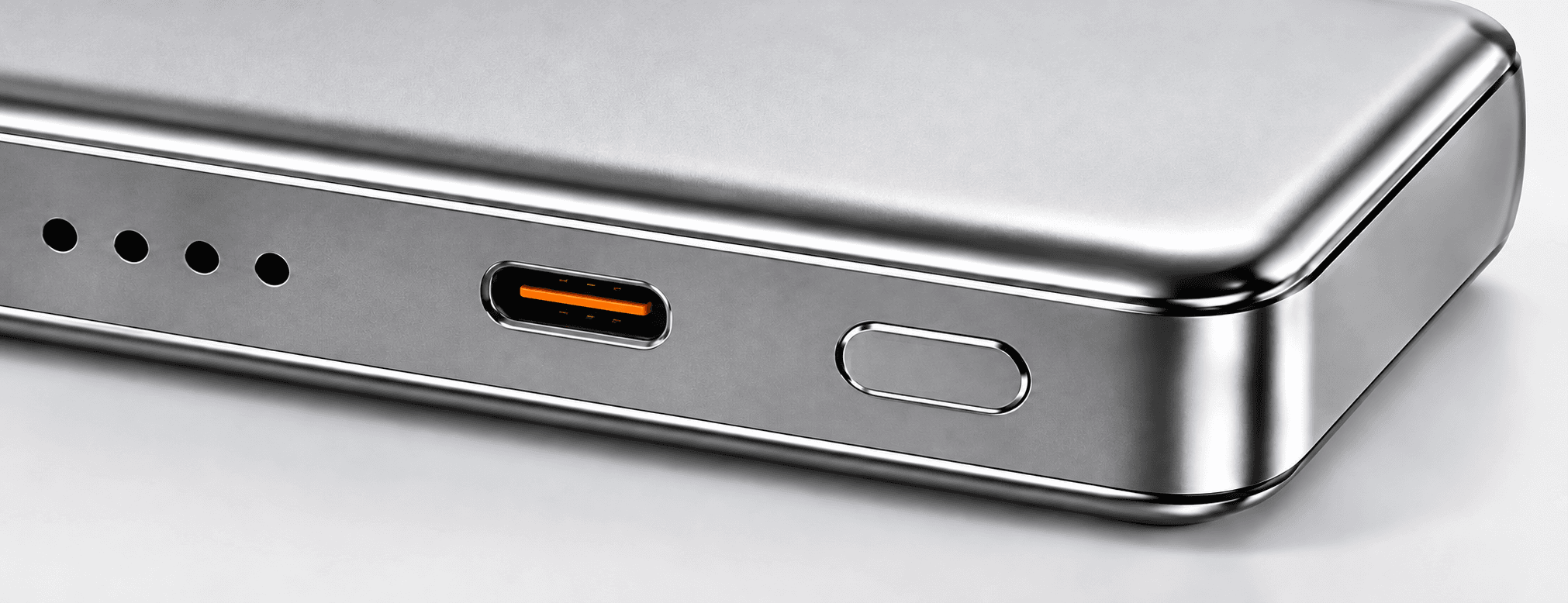
Check nearby features, including seams, buttons, ports, displays and existing labels. A decorative mark should not hide operating information or imply a function that the product does not have. If the proposed face is a magnetic attachment surface, ask which areas can be marked without affecting the intended construction or use. The supplier should confirm the usable area before the artwork is locked.
5. Match the design to a confirmed marking method
Discuss the desired visual result before requesting a specific machine process. A restrained single-tone mark and a full-color graphic have different requirements. The following comparison is a starting point for discussion, not a promise that every method is available on every ZONNGOO model or surface.
| Method to discuss | Main design question | What the sample should resolve |
|---|---|---|
| Laser marking | What contrast is achievable on this material and finish? | Actual mark appearance, detail and placement |
| Screen or pad printing | Does the artwork suit the surface and proposed solid colors? | Color, coverage, edges and repeatable position |
| UV printing | Can the surface support the intended multicolor image and finish? | Color appearance, substrate compatibility and agreed adhesion checks |
TRUMPF’s material guidance shows why laser marking must be considered in relation to the substrate. The word “laser” does not by itself define the final logo color. Mimaki’s UV-printing guidance also discusses material-dependent adhesion and preparation. Ask the supplier to confirm the proposed method and evidence for the actual housing rather than transferring a result from an unrelated material.
6. Define color expectations without relying on a screen
Supply your brand color reference and explain which aspects are critical. A screen preview is helpful for layout, but monitor settings and the physical surface can change perceived color. Ask how the supplier will compare the sample with your reference and whether the selected process supports the intended color treatment. Do not treat a rendered metallic or white logo as evidence of the available production result.
For multicolor artwork, discuss fine boundaries, any white underbase and the intended surface sheen. For a laser mark, focus on achievable contrast and appearance instead of assuming a standard ink color. Where exact matching is essential, agree the evaluation method before accepting a sample. A statement such as “match our red” is less useful than a defined reference and a recorded acceptance decision.
7. Review detail at the final viewing size
Print or display the artwork at the intended physical size during design review. Small taglines, narrow gaps and fine strokes can look clear in a large presentation but become difficult to recognize on a compact product. Ask the supplier to flag details that may need simplification. Approve any simplified version explicitly rather than leaving the production team to reinterpret the logo.
Consider normal viewing distance and lighting, not only a close-up photograph. Check the logo on the body color the customer will receive. If the mark includes small text, decide whether that text is necessary or can move to the packaging. Keeping the main product mark readable can be more useful than forcing an entire brand story into a small available area.
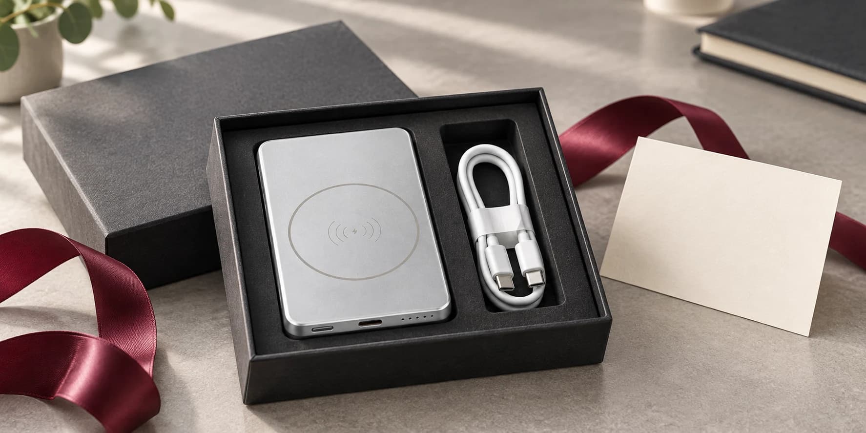
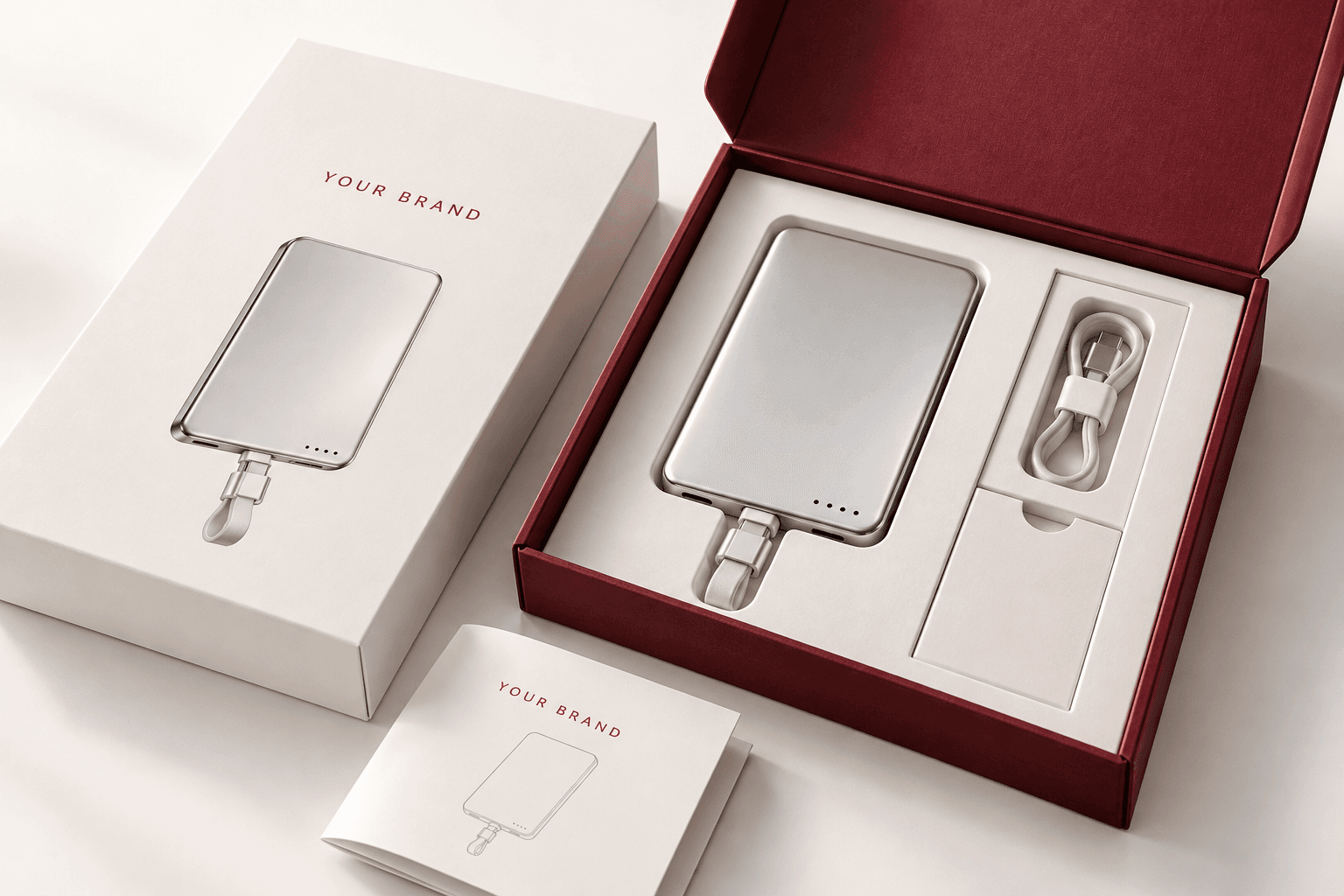
AI-generated gift-set concept; contents, branding and packaging must be confirmed for the selected order.
8. Use a sample to answer defined questions
Request a sample that represents the actual material, finish and marking process as closely as the agreed stage allows. Identify any difference from production. A digital mockup can answer layout questions, while a physical sample can help review contrast, position and surface appearance. Neither should be described as a completed durability test without an agreed test scope and record.
Make the approval checklist specific: correct artwork revision, size, orientation, location, visible edges, color or contrast, and the checks agreed for the marking process. If adhesion or wear resistance matters, agree the method, conditions and acceptance criteria with the responsible party. Do not invent a universal scratch test or claim years of resistance from an attractive sample photograph.
9. Keep logos separate from product and certification claims
A custom brand logo does not change the underlying model’s capacity, output profiles, battery chemistry or certification status. Keep the product specification connected to the exact supplied configuration. Do not add a certification mark, protocol logo or absolute safety statement to the artwork merely because another promotional image contains it. Rights to use a customer logo and rights to use a certification mark are different questions.
Where the product requires identification or operating information, agree how your branding will coexist with it. Avoid covering existing information in a mockup that will later be treated as a production reference. If the customization brief also requests a new feature, handle that through the appropriate product-development discussion, with its own scope and verification, rather than treating it as a graphic change.
10. Coordinate the product mark and gift presentation
For retail and corporate gifting, compare the product mark with the box, instruction insert and any presentation card. Their proportions do not need to be identical, but the correct logo version and brand treatment should be consistent. A large package face can carry information that would be too small on the power bank. Confirm the contents and finish of the whole set separately.
Our packaging approval checklist explains how to connect artwork, physical fit and the accepted sample. A coordinated appearance should not be confused with a complete packaging approval. Check both the marked product and its packed arrangement, and record which versions were accepted together so a later box change does not accidentally introduce an outdated logo.
11. Send a complete customization request
For a logo customization discussion, send the model and battery series, colors, quantity, vector master, preview, proposed dimensions, location and color reference. Explain the intended use and whether packaging should coordinate with the product. If you have not selected a method, describe the desired appearance and ask which options are suitable for that exact surface.
Use sample confirmation to define the next review stage. More extensive product changes can be discussed through ODM/OEM. Ask info@zonngoopower.com to confirm process availability, minimum order quantity, setup charges, sample costs, production timing and documentation for the project. Do not assume a fixed turnaround or minimum from a generic customization illustration.
Frequently asked questions
What logo file should I send for a custom power bank?
Send an editable vector master and a matching preview when available. Confirm the supplier’s accepted working formats. An SVG or PDF filename alone is not proof that the file contains clean editable vector artwork.
Is a screenshot of my logo enough?
It can communicate the idea, but a small screenshot may not provide suitable production edges or editable shapes. Tell the supplier what source files exist and agree any artwork preparation before approving a final design.
Should I choose laser marking or color printing?
Choose after reviewing the desired appearance, actual substrate and proposed process. Laser contrast and printed color depend on the surface. Ask for a representative sample rather than selecting from the process name alone.
Can the same artwork cover every product color?
The master can be shared, but appearance and contrast should be reviewed for each selected finish. Approval of one body color does not automatically establish the same result on another.
Does adding my logo change the product certification?
Do not assume it does. Certification and labeling questions must be checked against the exact configuration and applicable documents. A decorative logo approval is separate from permission to use protected certification marks.
What should the approval record contain?
Keep model, finish, process, artwork revision, dimensions, position, color reference, sample differences and agreed acceptance checks. Identify the approved release so production does not use an older file.
Conclusion
A reliable logo project starts with usable artwork and ends with a clearly identified approval on the chosen surface. Connect model, material, process, size, placement and color expectations in one brief. Review the real sample at its intended viewing size, document any changes and release a single approved revision. That gives both buyer and supplier a clearer basis for a consistent branded product.
Send your logo and product reference through the inquiry form below. ZONNGOO can review the brief and confirm the available marking options and sample scope before you commit to production.